Every Designer Should Know UI Elements
UI elements are the most integral part of product design. They are the core building blocks for all products, enabling interactivity and functionality through touchpoints like buttons, menus, and checkboxes.
As a UI designer or developer, a deep understanding of these elements—and how users interact with them—is crucial for creating intuitive application/website structures. Designers rarely build UI elements from scratch; instead, they start with a repository of pre-designed components (often backed by code).
Tools like UXPin Merge streamline this process by allowing teams to import coded components directly into the design editor, enabling fully functional prototypes in minutes. Learn more about UXPin Merge.
What Are UI Elements?
User interface (UI)UI elements are the building blocks of digital experiences. They facilitate user interaction—whether it's clicking a button to sign up, navigating through a menu, or using a scrollbar.
A well-designed interface follows familiar design patterns that ensure clarity and ease of use. Breaking these patterns risks confusing users, so designers rely on established UI conventions to create intuitive interfaces.
Common UI Elements:
- Interactive components: Buttons, scrollbars, checkboxes.
- Navigational tools: Menus, tabs, breadcrumbs.
- Informational elements: Icons, tooltips, progress bars.
- Containers: Sections that group related content together.
Understanding when and how to use these elements is just as important as knowing what they are.
Why Mastery Matters
Every craftsman must master their tools:
- A painter understands paints and brushes.
- A carpenter knows the difference between a hammer and a mallet.
- A composer arranges musical notes purposefully.
Similarly, UI designers must deeply understand UI elements to create seamless, user-centric experiences. By leveraging familiar patterns and optimizing workflows (e.g., with tools like UXPin Merge), designers can focus on innovation rather than reinvention.
Their tools of choice are UI components that, when thoughtfully combined, create exceptional mobile apps and websites.
Their tools of choice are the various UI components that, when thoughtfully put together, allow them to create exceptional mobile apps.
Types of UI Elements
UI elements typically fall into three broad categories:
1. Input Elements
Input elements are responsible for handling different user inputs. Sometimes they’re also part of the input validation process. Some of the most used input elements include
These allow users to enter information or interact with the system. Without them, an app would be mostly static. Examples include:
- Text fields
- Checkboxes
- Radio buttons
- Dropdowns
- Sliders
- Toggles
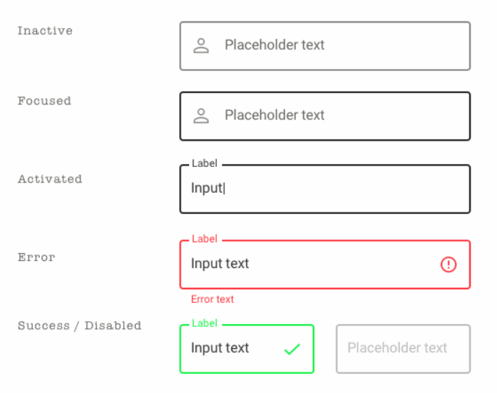
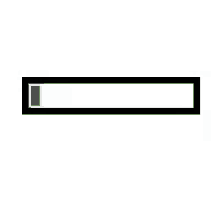
Text fields
Text fields areas where users can input alphanumeric characters, whereas password fields are specifically designed for entering confidential information like passwords. Password fields often hide the entered characters for security reasons.
Text fields are UI elements where you can input words. They’re often part of a form.
Source: Sketch App Sources
A good practice for text fields is to have indicators that communicate their state. Most commonly, this is done with colored borders or small icons.
For instance, a red text field can indicate that you entered something wrong, while a grayed-out border means the text field is inactive.
It’s also important to vary the size of the text field based on the estimated input length. This prevents awkward cropping.
Combo boxes
They combine the features of a text box and a dropdown. Users can either type a response or select from a predefined list by clicking a dropdown arrow. This provides flexibility for both manual input and selection from a set of options.
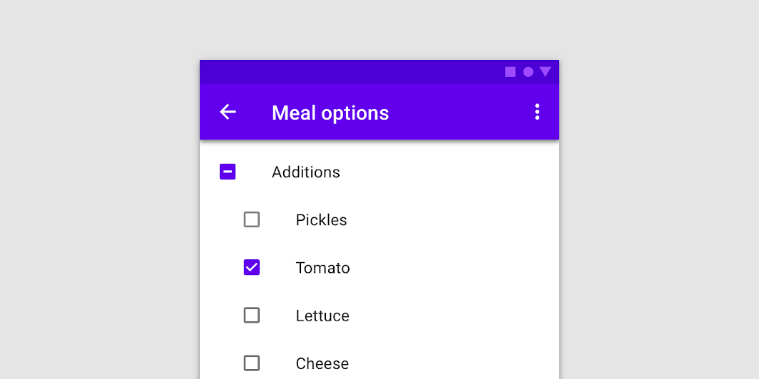
Checkboxes
Checkboxes – small, interactive elements that allow users to select or deselect options independently. They are often used in lists or forms where users can choose multiple items from a set.
A checkbox is similar to a radio button in that it lays out a list of fixed options for you to choose from. But the big difference is that you can select more than one item at a time.
Source: Material.io
Checkboxes allow the user to select one or more options from an option set. It is best practice to display checkboxes vertically. Multi-columns are also acceptable considering the available space and other factors.
Source: Github.com
In UI design, a checkbox appears exactly as the name suggests: a little square box on the screen that the user can check or uncheck. A checkbox allows users to select one of multiple options from a list, with each checkbox operating as an individual. Checking the checkbox marks it with a little tick! Some common use cases for this element include forms and databases.
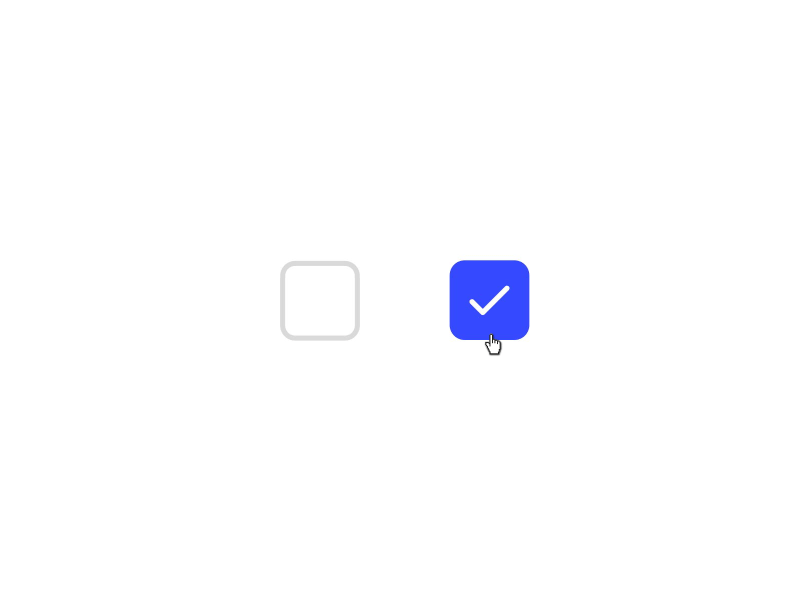
Image by Shakuro
Checkboxes are useful for questions that accept more than one input. For instance, a health app can ask users to check all the symptoms that apply to them.
This element is often presented as a vertical list but can also be laid out in multiple columns. This is especially useful if you want to compare lists with each other.
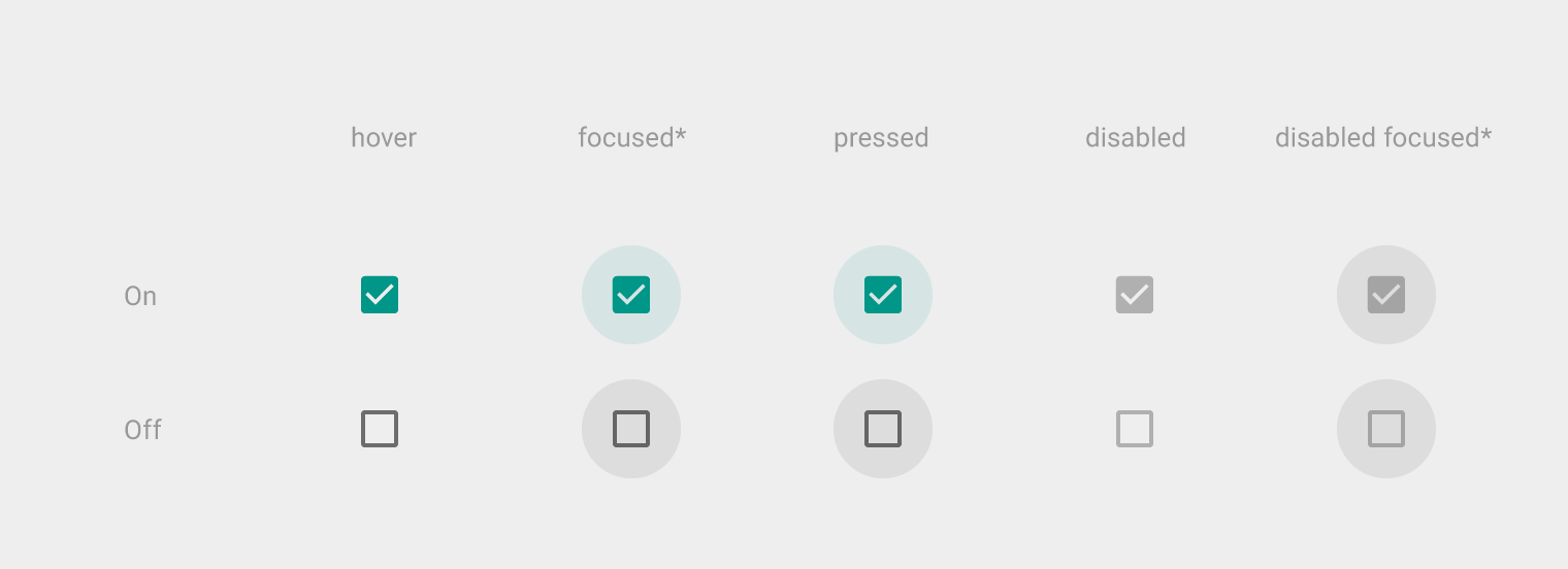
Toggles
A toggle is basically an on/off switch that allows users to set a variable by choosing between two states.
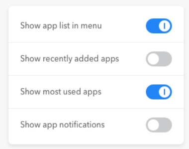
Source: UX Movement
A toggle is ideal whenever you want the user to activate or deactivate something in your app. It’s no surprise, then, that this element is mostly used in your app’s settings screen.
With toggles, it’s a good practice to make the on state visually distinct from the off state so that users can differentiate between them at a glance.
A common approach is using gray to represent the inactive state.
###Confirmation dialogues
Confirmation dialogues are responsible for collecting user consent for a particular action. For example, collecting user consent for a delete action.
Confirmation dialogues – pop-up messages that appear to confirm an action or decision before it is executed. They typically ask the user to confirm or cancel an operation to prevent accidental or unwanted actions.
Source: Dribbble.com
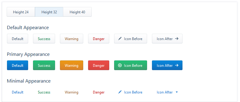
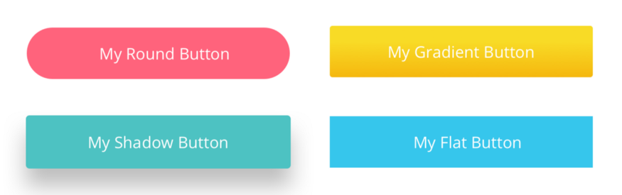
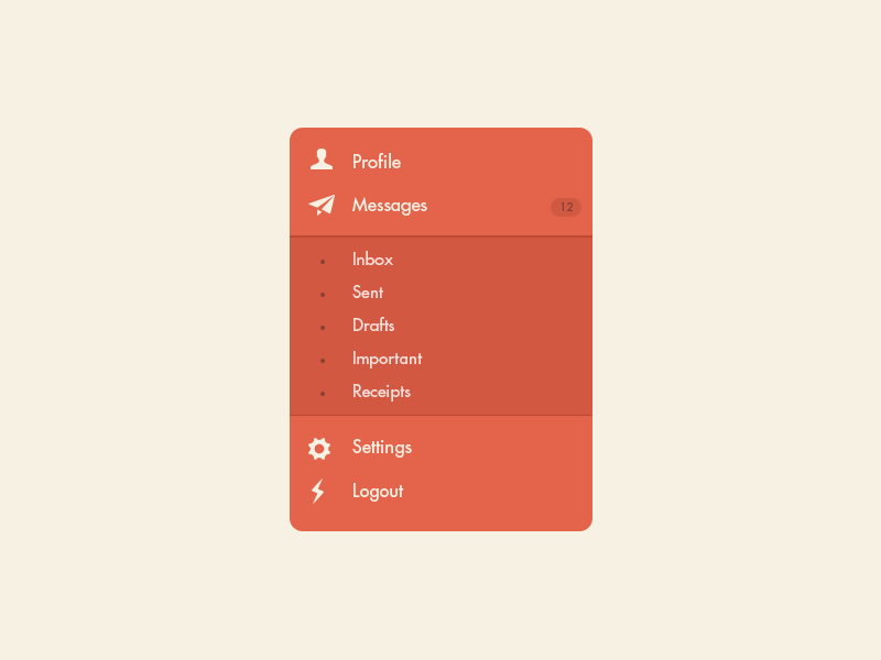
Buttons
Buttons allow the users to perform an action with touch or click. It is typically labelled with text, icon, or both. Buttons are one of the most important parts of a UI. So it’s important to design a button that the user will actually click.
Source: Evergreen UI
Buttons – interactive elements that users can click to trigger an action or submit a form. They often have labels indicating the action they will perform, such as “Submit,” “Cancel,” or “OK.”
Buttons are elements that perform an action when tapped, such as submitting a form or closing a window.
Traditionally displayed as shapes with a label, buttons are a vital user element that tells users they can perform a particular action, like submitting.
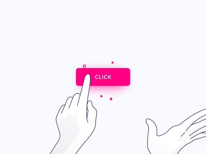
Image by Gal Shir
It’s often rectangular with rounded corners. The label can be either an image or text, which should be readable with a clear and concise copy.
Source: Linda Wilson | Medium
Buttons usually have bright colors that draw the eye in, such as red and yellow. This is because most buttons are very important elements, so they should be noticeable at all times.
You can also make buttons react to user input, for instance, by changing colors when you tap on them. This is a good practice for UX as it makes your app more responsive.
Toggle
Toggles allow the user to change a view/value/setting between two states. They are useful for toggle between on and off state or switching between list view and grid view.
Source: Youtube
Toggle switches – UI elements that allow users to switch between two states, typically on and off. They provide a visual indication of the current state and can be toggled by clicking or sliding.
Think of toggles as on and off switches. They let us do just that: turn something on or off.
Picker
A date picker allows users to pick a date and/or time. By using a native date picker from the platform, a consistent date value is submitted to the system.
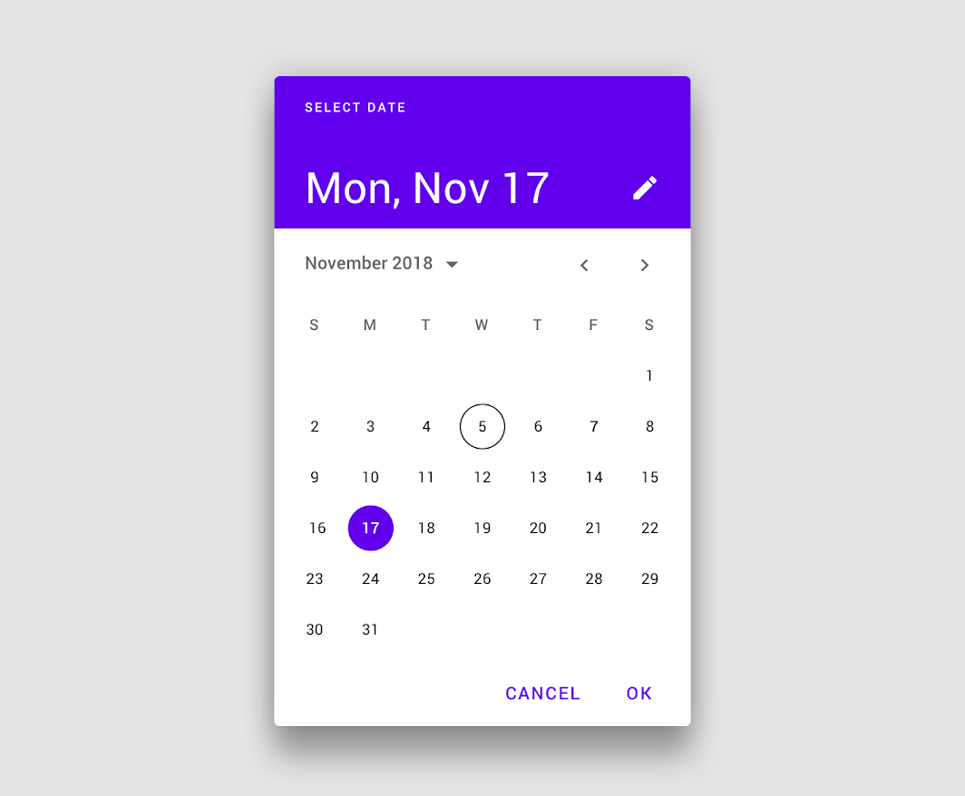
Source: Material Design
Date pickers – UI elements that facilitate the selection of dates from a calendar. Users can typically choose a date by clicking on a specific day, month, and year within the provided interface.
Date and time pickers let users pick dates and times. The advantage of using pickers over input fields is the ability to keep all the data users enter tidy and consistently formatted in a database, making information manageable and easy to access.
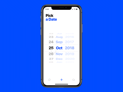
Image by Edoardo Mercati
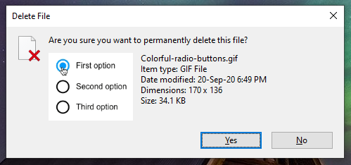
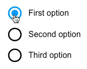
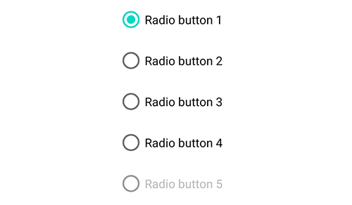
Radio buttons
Radio buttons allow users to select only one of a predefined set of mutually exclusive options. A general use case of radio buttons is selecting the gender option in sign-up forms.
Source: UXPin
Radio buttons – they present a set of options to users, but unlike checkboxes, only one option can be selected at a time. When one radio button is selected, any others in the group are automatically deselected.
Like a dropdown list, a radio button lets you pick one option from several choices. But in this case, all items are already laid out. Any invalid choices are grayed out.
Source: Material.io
Radio buttons let you present a long but fixed list of items that you’re sure won’t change in the future.
Days of the week or months in a year are a good example. They’re also popular elements when configuring settings in your app.
Often confused with checkboxes, radio buttons are small circular elements that let users select one option among a list. The key here is noting that users can only choose one option and not multiple options like they can with checkboxes.
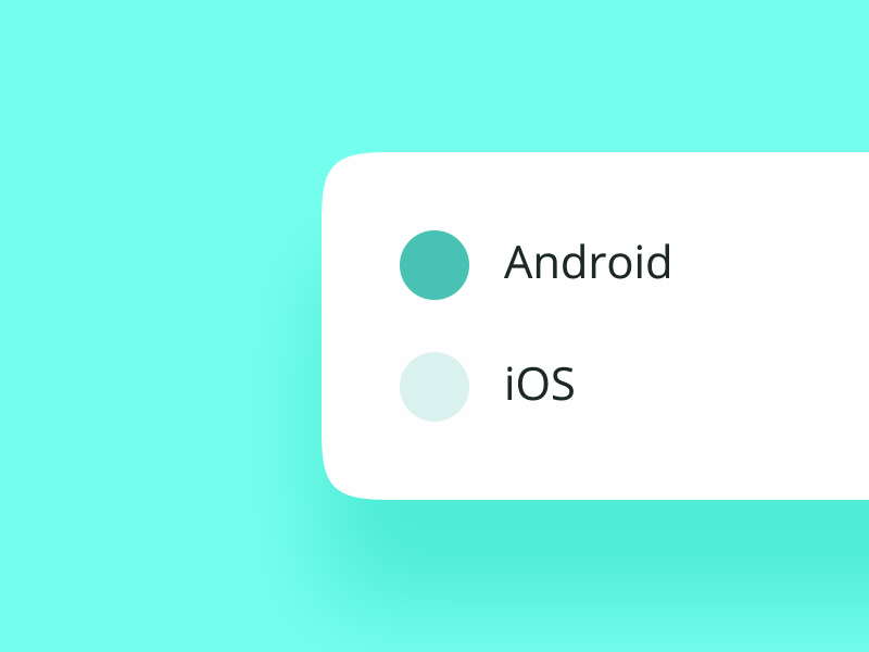
Image by Oleg Frolov
2. Output Elements
Output elements are responsible for showing results against various user inputs. They also show alerts, warnings, success, and error messages to the users. Output elements aren’t neutral by nature. They rely on inputs and various operations.
These display results or feedback based on user actions. Examples include:
- Notifications
- Progress indicators
- Tooltips
- Modals
3. Helper Elements
All other elements fall into this category. The most widely-used helper elements include:
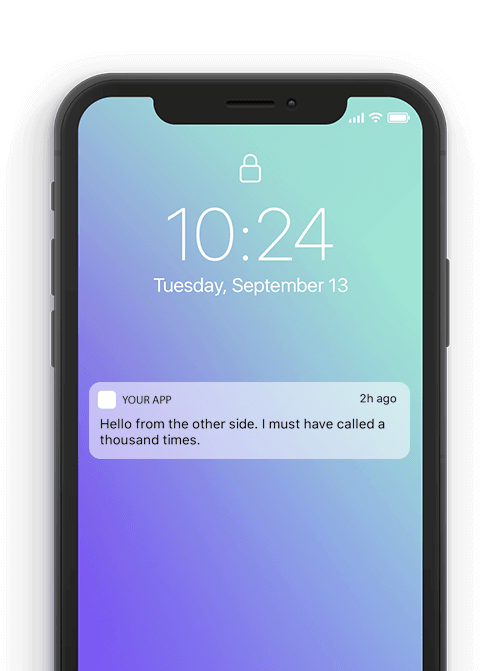
Notifications
Notifications – messages or alerts that appear on a user’s device or screen to inform them about important or relevant information. They can include updates, reminders, or warnings and are often designed to grab the user’s attention.
Notifications are off-app elements (as they appear when the user is outside the app) that alerts the user to something important.
This can be a new update, an error, or a critical event that needs their attention.
You’ll find these little red dots everywhere on interfaces today. They let us know there is something new, like a message, for us to go check out.
However, notifications don’t just tell us someone has liked one of our posts—they can let us know an error occurred, or a process was successful.
Source: Mo Engage
Notifications are great at improving retention. That’s because they subtly encourage the user to return to the app, especially if they haven’t used it for a while.
However, it’s very important not to overdo sending notifications. Too many of them can annoy users, leading them to uninstall the app.
The notification content should also be relevant, personalized, and beneficial. Also, don’t forget to ask for permissions properly to encourage click-through.
Breadcrumb
Breadcrumbs – small navigational elements that show the user’s current location within a website or application. They typically appear as a trail of links at the top of a page, indicating the hierarchical path back to the main or home page.
These little trails of links help users figure out where they are within a website. Often located at the top of a site, breadcrumbs let users see their current location and the proceeding pages. Users are also able to click on them to move between steps.
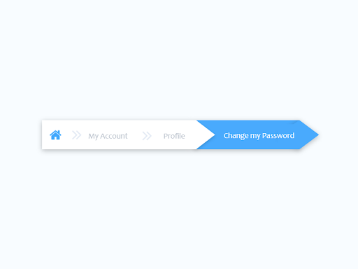
Image by Sharon Olorunniwo
Icon
Icons – graphical symbols or small images used to represent actions, objects, or concepts. They serve as visual cues to help users quickly understand and navigate interfaces. Icons are commonly used in menus, toolbars, and buttons.
Icons are images used to communicate a variety of things to users. They can help to better communicate content or can communicate and trigger a specific action. You can learn how to design icons from scratch in this step-by-step guide to the icon design process.
Image by Eddie Lobanovskiy
Slider Controls
Sliders – UI elements that allow users to select a value from a continuous range by dragging a handle along a track. They are often used for settings like volume control or adjusting numerical values within a specified range.
Sliders are a common UI element used for selecting a value or a range of values. By dragging the slider with their finger or mouse, the user can gradually and finely adjust a value—like volume, brightness, or desired price range when shopping.
Progress bars
Progress bars – visually represent the completion status of a task or process. They typically consist of a filled-in portion that grows as the task progresses, providing users with a visual indication of how much work has been completed and how much is left.
Progress bars communicate to users how far along they are in a series of steps. They can be as simple as a bar with a percent indicator below it.
Or they could also include a breakdown of the steps, as depicted below.
Source: Dribbble
Progress bars help users visualize where they are in a series of steps. You’ll commonly find them on checkouts, marking the different stages a user needs to complete to finalize a purchase, like billing and shipping.
Progress bars can help make a long task manageable by breaking it down into chunks. It also sets the user’s expectations on the time commitment needed to complete it.
From a psychological perspective, a progress bar gives a feeling of fulfillment once you complete it. This can have a tremendously positive effect on your app’s UX.
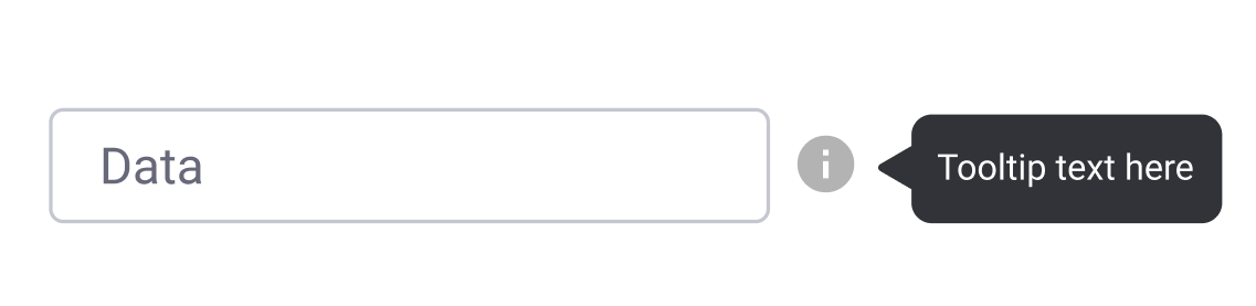
Tooltip
Tooltips – small, contextual messages that appear when a user hovers over or clicks on a specific UI element. They provide additional information or explanations about the purpose or functionality of the element, aiding user understanding and interaction.
Tooltips provide little hints that help users understand a part or process in an interface.
We can also group helper elements into 3 categories. These assist in navigation, structure, or drawing attention to key areas. They can be further divided into:
- Navigational elements: Menus, breadcrumbs, pagination.
- Informational elements: Alerts, badges, tooltips.
- Containers: Cards, panels, sections.
By understanding and strategically applying these elements, designers can create intuitive, effective, and user-friendly interfaces.
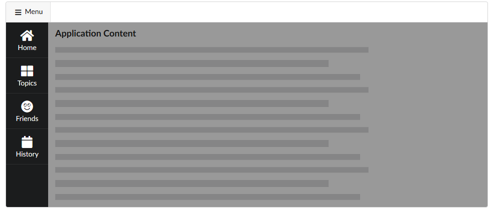
Navigational UI elements
Navigational components simplify moving through the site, desktop or mobile app or any other digital product. Navigational helper UI elements include things like navigation menus, list of links, breadcrumbs, to name but a few.
Source: UXPin
Informational UI elements
Responsible for representing information. These include, for example, tooltips, icons, and progress bars.
Source: Toptal
Container components
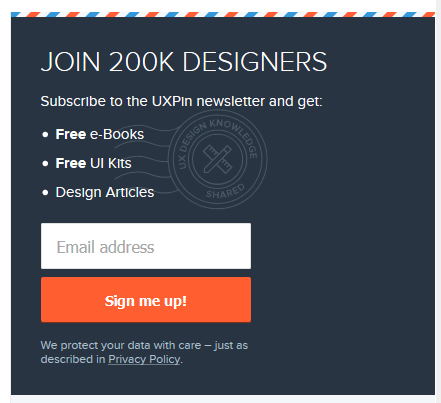
Container Responsible for holding various components together. Widgets, containers, and sidebars for part of this category. The Newsletter subscription widget of UXPin blog is also a good example of a container.
Components hold related elements together in your app. Their main purpose is to help organize the UI to look less cluttered.
Some containers also hide UI elements when unnecessary to prevent overwhelming the user.
Here are some common container components.
9 Common Input UI Elements
Here are nine of the most common input elements that every designer should know about. This list includes buttons, checkboxes, text fields, and you’re certain to find them in the most popular design systems, listed under UI components.
Checkboxes
Dropdowns
Combo boxes
Buttons
Toggles
Text and password fields
Date pickers
Radio buttons
Confirmation dialogues
Text and password fields
Text fields and password fields allow users to enter text and password respectively. Text fields allow both single-line and multi-line inputs. Multi-line input fields are also known as “textarea”. Password fields generally allow single lines for a password.
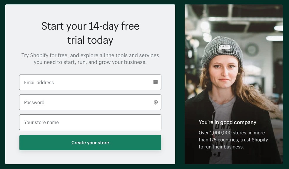
Source: Shopify.com
4 Common output elements
Alert UI Element
An alert presents a short, important message that attracts the user’s attention. It notifies users about these statuses and outputs.
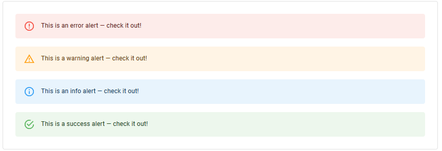
Source: material-ui.com
Toast UI element
This refers to a UI feature where an event (user input, server response, calculation etc.) triggers a small text box to appear on the screen. Ideally, it appears at the bottom on mobile and bottom left or right side on the desktop.
The difference between “Alert” & “Toast” is that the former doesn’t dismiss itself and the latter does after a certain time.
Source: Evergreen UI
Badge
This feature generates a small badge to the top-right of its child(ren). In general, it represents a small counter or indicator. This can be something like the number of items over the cart icon or online indicator over a user avatar.
Charts
Charts are a common way of expressing complex data sets because they depict different data varieties & data comparisons.
The type of chart used in UI depends primarily on two things: the data we want to communicate, and what we want to convey about that data
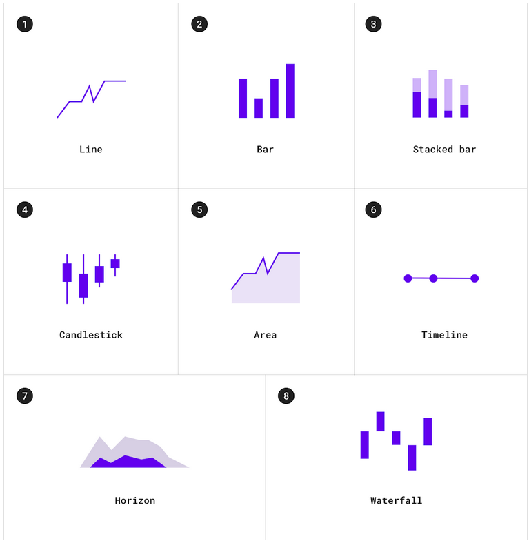
Different types of charts. Source: material.io
Common Helper UI Elements
Navigational UI elements
Those elements aid navigation.
Navigation menus – graphical interfaces that present a list of links or options, allowing users to move between different sections or pages of a website or application. They are commonly found at the top, side, or bottom of a page and serve as a primary means of guiding users through the content.
Navigation menus
This is a navigational UI element with several values that the user can select. They are taken to another area of the website/app from there.
Source: UXPin
List of links – a collection of hyperlinked text items that typically direct users to different pages or resources. Lists are often used in navigation menus, sidebars, or content sections to organize and present a set of related links in a structured format.
List of links
As the name suggests, a list of links consists of links. Sidebar with a category list is a good example of this. Links can be both internal and external.
- Breadcrumbs: Breadcrumbs are a navigational aid that displays the user’s current location within a website or application. They appear as a series of links, usually at the top of a page, indicating the hierarchical path back to the main or home page. Breadcrumbs help users understand their position in the site’s structure.
Breadcrumbs
Breadcrumbs allow users to see their current location within the system. It provides a clickable trail of proceeding pages to navigate with.
- Search fields – input elements that allow users to enter search queries. They are commonly accompanied by a button or icon to initiate the search. Search fields enable users to quickly find specific content within a website or application.
Search fields
A search bar is usually made up of two UI elements: an input field and a button. It allows users to enter a keyword and submit it to the system expecting the most relevant results.

Source: Google Chrome Browser
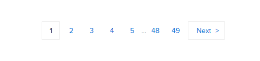
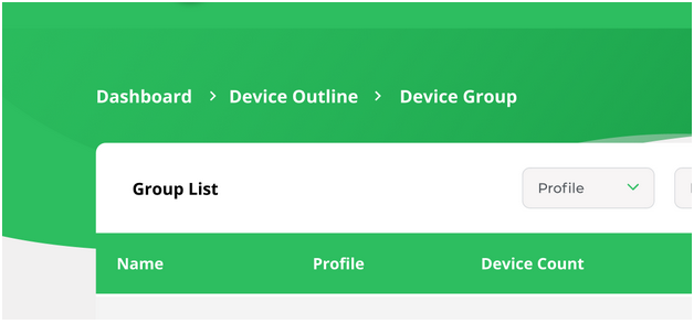
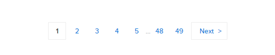
- Pagination – divide the content into separate pages to improve navigation and loading times. It involves organizing large sets of data or results into numbered pages, with links or buttons to move between them. Pagination is often used in search results, lists, or other content-heavy sections.
Paginations
This feature divides the content between pages and allows users to navigate between them.
Informational ### UI elements
That category of UI elements transfers information. It comprises:
- Tooltips
- Icons
- Progress bars
- Notifications
- Message boxes
- Modal windows
Tooltips
A tooltip shows users hints when they hover over an element indicating the name or purpose of the item.
Tooltip is another UI element
Icons
It’s a simplified symbol that is used to help users to navigate the system, presenting the information and indicating statutes.
A well-known UI element is an icon. What a surprise!
Source: Dribbble
Progress bars
A progress bar indicates the progress of a process. Typically, progress bars are not clickable.
Here's a progress bar which is a UI element
Source: Tenor
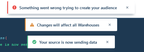
Notifications
It is an update indicator that announces something new for the user to check. Typically shows completion of a task, new items to check etc.
Notifications are also UI elements
Message boxes
It’s a small window that provides information to users but typically doesn’t prevent users from continuing tasks. Message boxes perform tasks like showing warnings, suggestions, etc.
Another UI element is a message box
Source: Evergreen UI
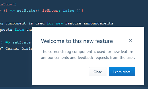
Modal windows
It’s used to show content on top of an overlay. It blocks any interaction with the page — until the overlay is clicked, or a close action is triggered.
Modal window is an UI element
Source: Evergreen UI
Group and Containers
How would you separate certain elements from the rest? That is what groups and containers are for.
Widgets
It’s an element of interaction, like a chat window, components of a dashboard, or embeds of other services.
Who haven't heard about widgets? a popular UI element!
Source: Dribbble.com
UI Containers
Containers hold different components together. This includes text, images, rich media etc. Cards in modern UI design are one of the best examples of containers.
UI containers are common UI elements. This one comes from material design
Source: Material.io
Sidebars
Sidebars also contain other groups of elements and components. But that can be switched between collapse and visible state.
Sidebar in Semantic UI is an example of UI element
Source: Semantic-UI
Search bar
The search bar holds the search field and search options. Typically, the search bar features a search field and filtering option. Twitter’s advanced search is a great example.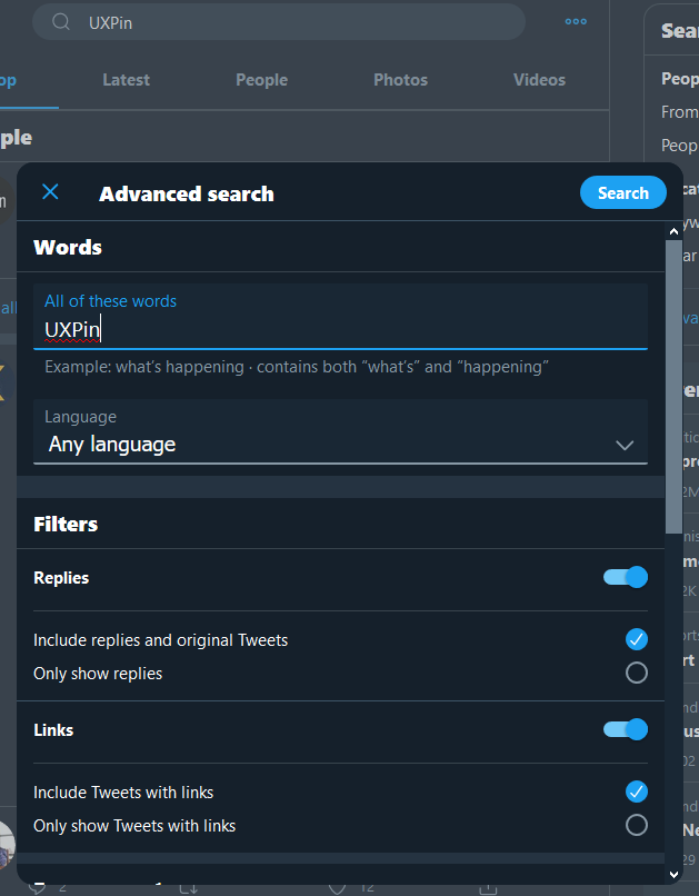
Twitter search bar UI element
Source: Twitter
Input Field
Input fields are, quite simply, a place for users to enter content into the system. They aren’t just limited to forms, either—search bars are input fields as well.
Kebab Menu
We’ve covered the hamburger menu and the döner menu: now for another (non-edible!) UI element: the kebab menu. Consisting of three vertical dots, the kebab menu represents a set of grouped options.
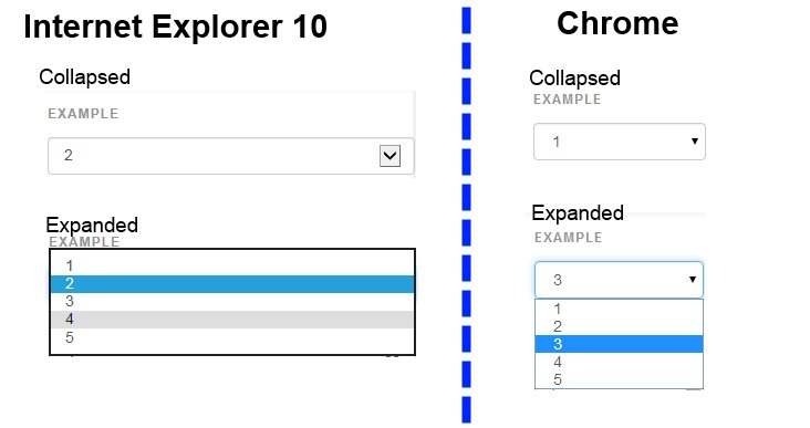
Dropdown lists
This controversial UI element allows users to select an item from a list that “drops down” once they click on it. To learn more about why this element has a lousy rep, check out this naughty presentation.
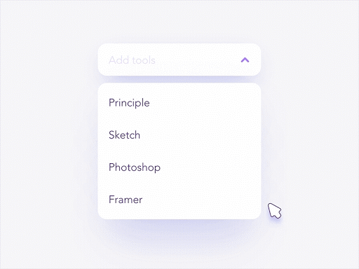
Image by Shakuro
Dropdowns allow users to select one item at a time from a long list of options. They are more compact than radio buttons. They also allow you to save space. For better UX, it’s necessary to add a label and a helper text as a placeholder. I.e. “Select One, Choose, etc.”
Source: Stackoverflow
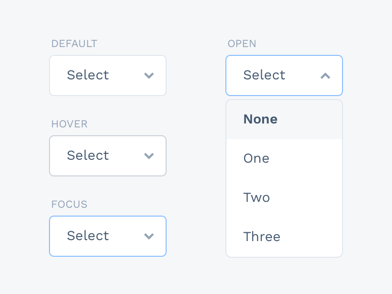
Dropdowns – control elements that allow users to select one option from a list that appears when they click or hover over a specific area. The list “drops down” when activated, providing a set of choices for the user to pick from.
A dropdown list is an element that presents a list of options when you tap on it. You can only choose one item from it, which becomes the default display after you pick it.
Source: Sketch App Sources
Dropdown lists are often part of a form (which we’ll discuss later in this article). They’re useful for presenting long and variable lists of items without taking up too much space.
For example, let’s say you want users to choose among the employees in your company. A dropdown is the best approach since the choices (employees) can vary over time.
Like text boxes and buttons, dropdown lists can also be responsive—for instance, they can change border colors when you tap on them.
Search Field
Commonly represented as an input field with a little magnifying glass inside of it, search fields allow users to input information to find within the system.
Sidebar
A sidebar displays a group of navigational actions or content literally on the side of a page. It can be visible or tucked away.
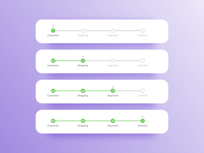
Stepper
Steppers are two-segment controls that also let users adjust a value. However, unlike sliders, they allow users to alter the value in predefined increments only.
Tag
In UI design, tags are essentially labels which help to mark and categorize content. They usually consist of relevant keywords which make it easier to find and browse the corresponding piece of content. Tags are often used on social websites and blogs.
Tab Bar
Tab bars appear at the bottom of a mobile app and allow users to quickly move back and forth between the primary sections of an app.
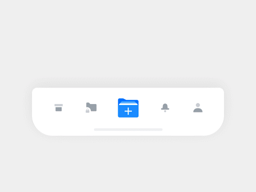
Image by Hoang Nguyen
Navigational components
Navigational components help users move through the app. They’re crucial because the app’s flow would be disrupted without them. This can lead to friction.
The best navigational schemes are intuitive and predictable. Here are some components that could help you achieve this.
Hamburger menus
The hamburger menu is so-named because the three-line icon looks like an abstract representation of a burger. When clicked, it brings up a hidden menu.
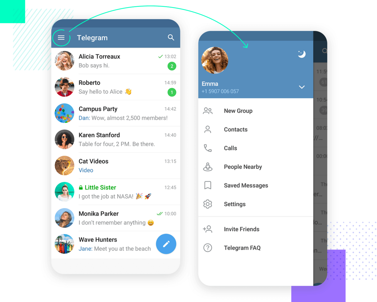
Source: Just in Mind
The hamburger menu is a popular navigation scheme in apps because it’s universally well-known. People instinctively know what happens when they tap on it.
In addition, hidden menus allow you to include extensive menus without cluttering the screen.
It’s also good for UX since users can bring up the side menu only when needed, reducing overwhelm.
Sidebars
A sidebar is a hidden menu item that pops up on the left or right side of the screen whenever users tap a button or perform a swiping gesture.
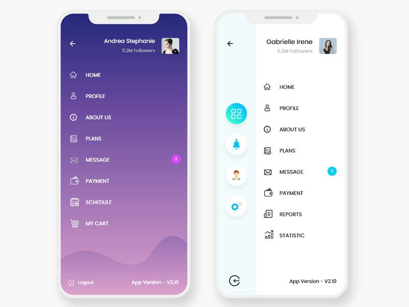
Source: Epic Pxls
The biggest advantage of sidebars is that they’re excellent space savers. That makes them indispensable for creating minimalistic user interfaces.
Tab bars
Tab bars are a common navigation scheme in iOS. It’s a series of menu icons that run on the bottom of the screen, each representing a major section of the app.
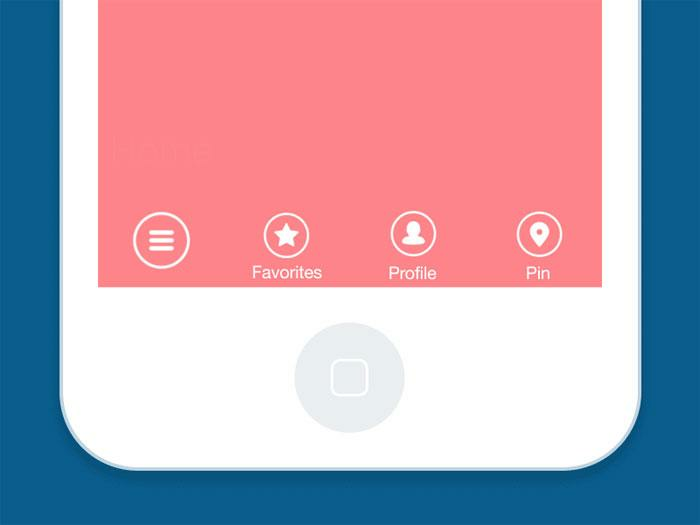
Source: Design Your Way
Tab bars make it easy to navigate quickly from one part of the app to another, similar to how browser tabs facilitate switching from one website to another.
The other reason they’re widespread is that they’re located at the bottom of the device.
Thus, people who hold their phones one-handed can comfortably tap the buttons using only their thumb.
Carousels
Carousels allow users to swipe horizontally to browse through a series of UI elements quickly, mostly images.
The dots below the carousel indicate how many items you’re browsing through and which item you’re currently at.
A carousel creates an experience akin to flipping through the pages of a book, which is a familiar feeling for most users.
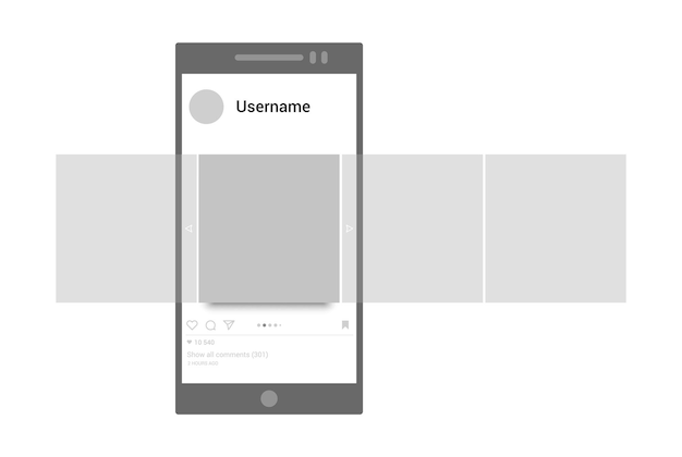
Source: Freepik
Carousels allow users to browse through sets of content, like images or cards, often hyperlinked to more content or sources. The biggest advantage of using carousels in UI design is that they enable more than one piece of content to occupy the same area of space on a page or screen. If you decide to use carousels, be sure to follow these guidelines set out by the Nielsen Norman Group.
The main benefit of carousels is that they help save time and effort since it’s faster to swipe through images than to tap on them individually.
They’re also ideal if users need to compare multiple items or photos.
Informational components
Informational components are crucial for communicating to the user. The app can use them to give feedback, alert the user to important updates, and provide helpful in-app hints.
Here are some of the common informational components that you’ll likely use.
Comment
Pretty common around interfaces today, comments display content users input into the system in chronological order. You’ve seen them around social media engines and on blog posts.
Pagination
Typically found near the bottom of a page, pagination organizes content into pages. Pagination lets users know where they are within a page and click to move into other sections.
Tooltips
Tooltips are text bubbles that pop up in context. Their purpose is to teach the user about a particular UI element or feature as they’re using it.
Source: Dribbble
Tooltips are commonly activated automatically when a user encounters an app screen for the first time.
Alternatively, you can also set tooltips to appear only when users tap on an icon (like a question mark).
Tooltips are vital for progressive onboarding and product walkthroughs, where users learn an app as they use it.
Loaders
Loaders are elements that indicate that the app is working in the background. It’s a subtle way of telling users to wait.
In apps, the most common loader is the spinner, which starts gray but gradually gains color as the task progresses. The spinner has the benefit of taking up minimal space.
Alternatively, if space permits, you can also go for a classic loading bar.
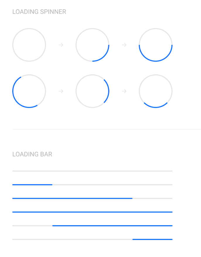
Source: Dribbble
Loaders can take on many, many forms—designers enjoy getting creative with them. Loaders are designed to let users know the system is completing an action in the background and should wait.
Image by Kickass
Loaders are important for UX as they communicate that the app is working fine instead of frozen.
They can also hide app latency and speed issues, especially if you have an engaging loading screen.
Accordions
Accordions are components with collapsible and expandable sections, allowing users to hide and show items when they tap on them. Accordions let users expand and collapse sections of content. They help users navigate material quickly and allow the UI designer to include large amounts of information in limited space.
Source: Dribbble
The main purpose of an accordion is to organize a long list of elements into manageable chunks so users have an easier time browsing through them.
They’re essential for mobile apps, enabling you to show more information on a smaller screen.
For instance, if you have an e-commerce app with dozens of products, you can have each category as an entry in an accordion.
That way, users can tap only on product categories that interest them, hiding everything else to reduce clutter.
Bento Menu
A bento menu, named after bento boxes, represents a menu with grid items. As you read along, you’ll begin to notice UI designer is just another word for a foodie—we love to name our UI elements after food.
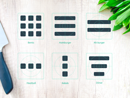
Image by Alex Lockwood
Meatballs Menu
Yet another member of the menu family is the meatballs menu—a set of three horizontal dots. The meatballs menu signifies that there are more options available, which are revealed when you click on the menu dots.
Döner Menu
A döner menu is a variation of the more well-known hamburger menu. While a hamburger menu consists of three lines of equal length stacked one on top of the other, a döner menu consists of a vertical stack of three lines of different lengths: a long line, a shorter line below it, and an even shorter line underneath that! This UI element represents a group of filters.
Hamburger Menu
These three little horizontal lines look slightly like America’s quintessential meal and represent a list menu. You’ll commonly find the hamburger menu on the top left-hand corner of apps and most likely containing a group of navigation links.
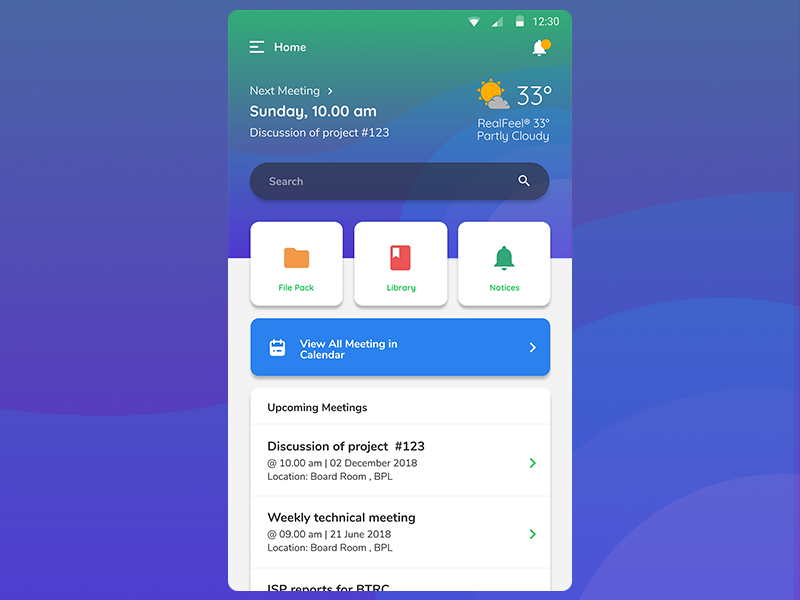
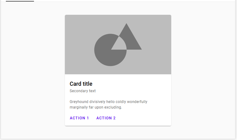
Cards
Cards are small elements that contain relevant groups of information in your app UI. It’s so named because they resemble real-life calling or credit cards.
Source: UX Planet
Cards are often used to summarize or recap information with a button or link that enables users to view more details if they choose to.
They’re also being increasingly used as a navigation tool, as seen in the Headspace app.
Source: Bootcamp
This tells you that cards can be very flexible. Anytime you need to organize information into a visual hierarchy in your UI, cards can be your go-to component.
Super popular these days, cards are small rectangular or square modules that contain different kinds of information—in the form of buttons, text, rich media, and so on. These user elements act as an entry point for the user, displaying different kinds of content side by side which the user can then click on.
Cards are a great UI design choice if you want to make smart use of the space available and present the user with multiple content options, without making them scroll through a traditional list.
Image by Crank
Feed
Here is an inescapable one! Feeds display user activity in chronological order. The content varies and can range from simple text to images to video. Think Twitter!
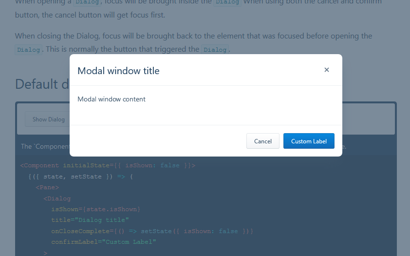
Modal
A modal window is a small box containing content or a message that requires you to interact with it before you can close it and return to your flow.
Think of the last time you deleted an item on your phone. The little message that popped up asking you to confirm that you wanted to remove it is a modal.
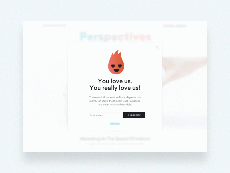
Image by Joshua Krohn
Forms
Forms are components that help apps collect and process related data, such as contact details or order information.
It’s analogous to filling out forms when opening a bank account or filing your tax returns.
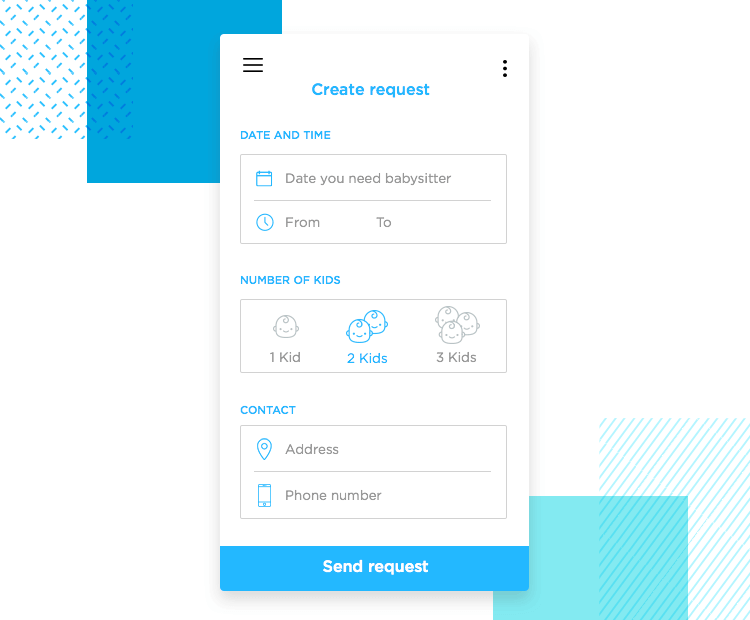
Source: Just in Mind
Forms help users input sets of related information into the system and submit them. Think of all the boxes asking for shipping details when you order something online.
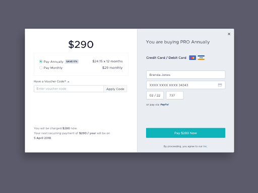
Image by girithaara
A form comprises individual input components, and a submit button at the end. When users tap this button, all the data in these input components will be processed or sent to a server.
One danger with forms, however, is that they can get very long and cumbersome.
A good workaround is dividing your form into multiple screens, each including only around three to four input components. This can help reduce clutter.
UI components are only the beginning
Knowing the various UI components at your disposal is crucial, but they’re only the first step.
Because to create exceptional app designs, you must discover how to put them together.
And that requires mastering app design principles, such as shape patterns and predictable navigation.
Luckily, we have just the resource for you.
Check out our article on the five fundamental app design principles you need to follow.
Categories
UX design
Final thoughts
And that’s it for our glossary of the most important UI elements!
If you’d like to learn more about user interface design, check out this video:
If you enjoyed this article, you may also be interested in taking a look at the following articles:
What Are Gestalt Principles? A Guide For UX and UI Designers
8 Websites With Really Awesome User Interface Design
5 Common questions I get asked as a UI designer
FAQ
What are UI elements?
User interface (UI) elements are the parts we use to build apps or websites. They add interactivity to a user interface, providing touchpoints for the user as they navigate their way around; think buttons, scrollbars, menu items, and checkboxes.
UI designers use UI elements to create a visual language and ensure consistency across your product—making it user-friendly and easy to navigate without too much thought on the user’s part.
What are some examples of UI elements names? What are the key elements of UI design?
Common UI elements include:
Breadcrumbs
Checkboxes
Dropdowns
Forms
Icons
Input fields
Notifications
Buttons
Text Fields / Input Fields
Dropdowns
Radio Buttons
Checkboxes
Sliders
Toggles / Switches
Icons
Modals
Tooltips
Tabs
Cards
Alerts / Notifications
Menus
Breadcrumbs
Progress Bars
Accordions
Tables
Carousels
And many more.
- Buttons: Trigger user actions and convey interactivity (e.g., Submit, Cancel).
- Inputs: Fields like text boxes, checkboxes, and dropdowns for data entry.
- Navigation: Menus, tabs, and sidebars that help users move through content.
- Cards: Containers for grouping related information (e.g., products, articles).
- Modals and Dialogs: Overlays that require user action, often for confirmations.
- Alerts and Notifications: Inform users of updates, warnings, or errors.
- Tooltips: Contextual hints for additional information.
Each UI component combines layout, color, typography, and spacing principles to ensure usability and consistency across designs.
UI elements usually fall into one of the following four categories:
Input controls allow users to input information into the system. If you need your users to tell you what country they are in, for example, you’ll use an input control to let them do so.
Navigational components help users move around a product or website. Common navigational components include tab bars on an iOS device and a hamburger menu on an Android.
Informational components share information with users.
Containers hold related content together.
How to identify UI elements?
Analyze the Functionality: Break down the UI by understanding what each element is meant to achieve—e.g., collecting user input, navigating between pages, or presenting content.
Visual Cues: Identify standard components by their shape and interaction patterns—e.g., buttons have a rectangular shape and react to clicks.
Interactive Behavior: Hover, click, or tap on elements to see if they exhibit interaction states like animations or color changes.
What You Should Do Now
Get a hands-on introduction to UI design and design your very first app screen with a free, self-paced UI design short course.
Take part in one of our FREE live online UI design events with industry experts, and read about UI graduate Florian’s career change to product design.
Become a qualified UI designer in just 4-9 months—complete with a job guarantee.
Design with Interactive UI Elements in UXPin
Now that you understand what common UI elements are and how they work, it’s time to put your knowledge to practice. UXPin offers all the features you need to design and organize your UI elements, simplifying the process of designing.
What if you have ready-made UI elements that come from a component library of your developers? Use UXPin Merge technology to bring them to UXPin editor and design fully interactive and consistent prototypes using those UI components that you share with your product team. Learn more about UXPin Merge.