We've all been there-you click on something, and suddenly, nothing happens-just a blank screen or a spinner doing laps. But waiting on the internet is going to happen, and it doesn't have to be painful and frustrating. In this post, we'll go over the art and science of better loading experiences-from skeleton screens and preloaders through progress bars to spinners-so you can keep users engaged and confident as they wait.

Why Loading Feedback Matters

No product can completely avoid delays in loading. Users may have slow connections, large datasets to fetch, or complex processes that need some time to complete. Even if your software is super fast, a number of factors outside of your control can make things crawl.
Good loading feedback:
- Lowers User Frustration: If people know something is happening, they'll be more patient.
- It communicates progress-it sets expectations for how long the wait might be.
- It reinforces trust-users feel like they're in capable hands-your product isn't broken, it's just busy.
- It adds a layer of branding or delight-preloaders and skeleton screens are opportunities to show off brand personality or to educate users rather than a "wasted" moment.

Core Principles for Great Loading Experiences
Give Immediate Feedback
As soon as the user initiates an action, say, clicking something or pulling to refresh, there needs to be feedback-a tiny spinning state on the button or an animated loading indicator-that lets users know their actions have been tracked.
Match Loading Indicator to Task
In cases where there is a very short wait (less than 1 second), you might not need more than a quick flash of visual feedback or a subtle micro-interaction.
For operations that may take a few seconds, consider progress bars or skeleton screens.
Manage Perceived Wait Times
Most people's perception of time is usually quite different whether they are being engaged or kept informed about what is going on. Simple illusions-like "fake" progress animations for extremely fast tasks-can make your product feel more robust or thorough.
Always Consider Context
Is it loading one list item or is this a systemwide process? Are you performing a crucial high-stakes operation or a minor background sync? The optimal style of loading feedback is based on both the scope and importance.
Usual Loading Patterns
1. Spinners (Throbbers)
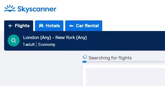
What they are: A spinner is a rotating icon, also commonly called a "throbber", that indicates ongoing activity but doesn't show actual progress.
When to use:
• Brief actions (2–5 seconds)
- Indeterminate durations when detailed progress isn't available
Pros:
- Easy to implement
- Universally known "loading" icon
Cons:
- No idea how long it will take
- Could annoy users if the wait stretches beyond expectations

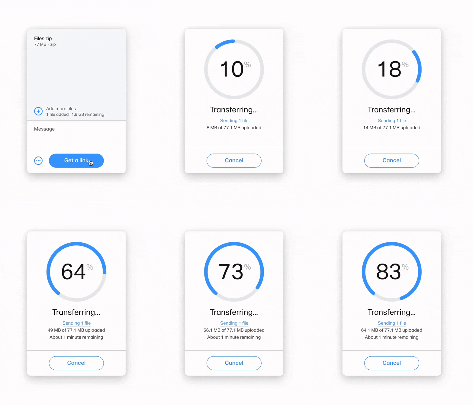
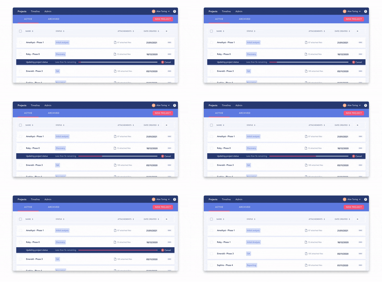
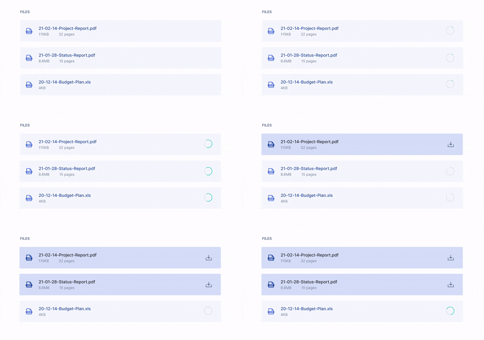
2. Progress Bars (Determinate Indicators)
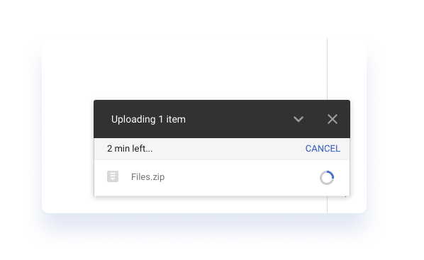
What they are: A horizontal (or, less often, circular) bar that fills according to the fraction of work that has been completed.
When to use:
- Tasks of predictable lengths; e.g., file uploads/downloads
- Processes you can reliably measure, such as "60% complete"
Pros:
- Clear sense of how much has finished and how much remains
- Reduces uncertainty
Cons:
- Requires fairly accurate estimates, as users hate stuck or jumping progress bars.
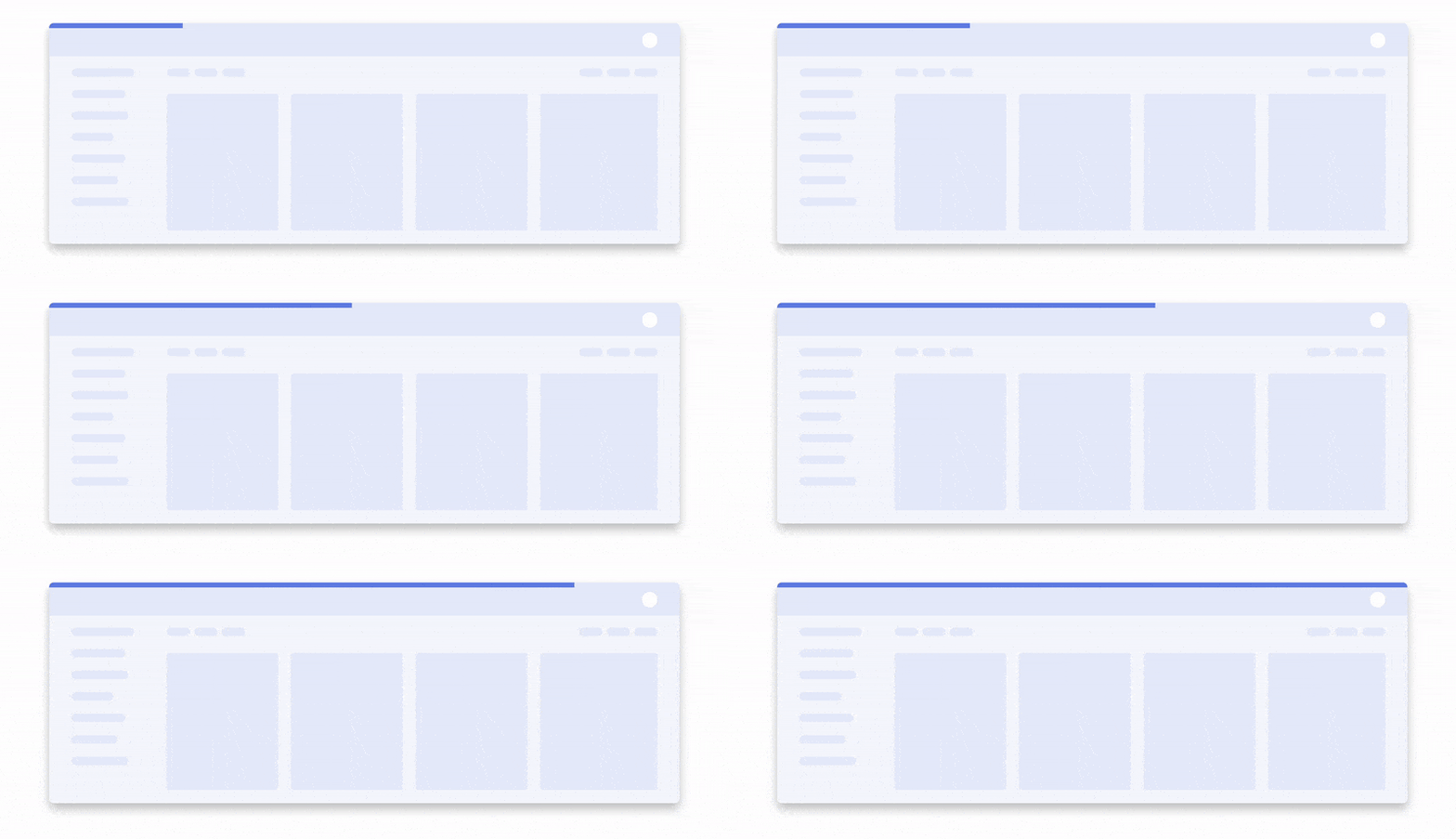
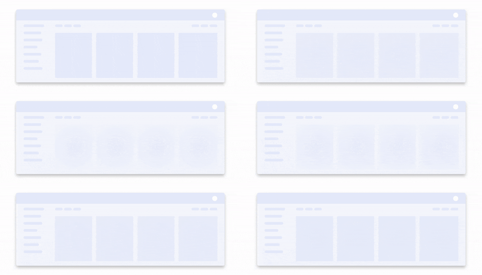
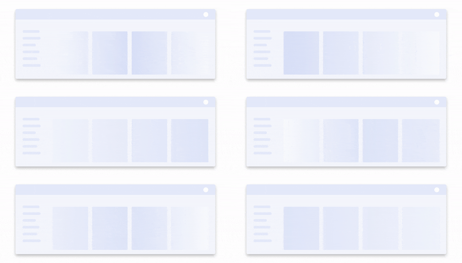
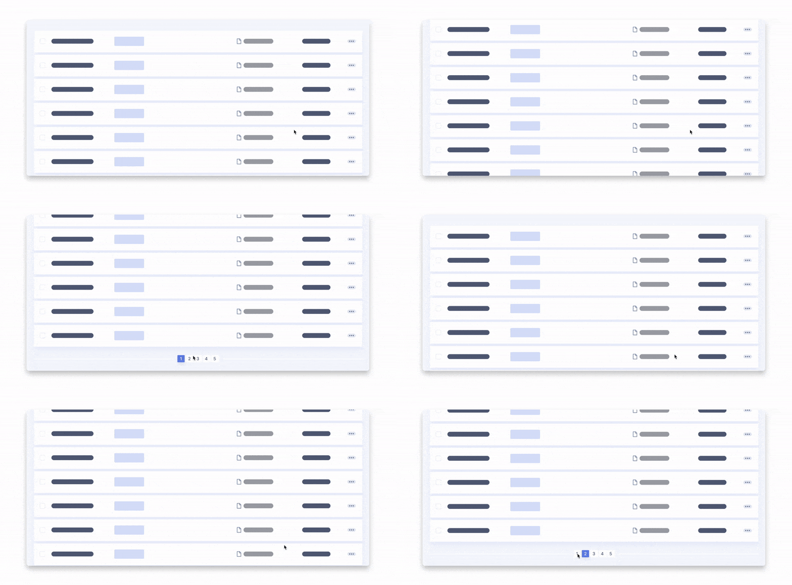
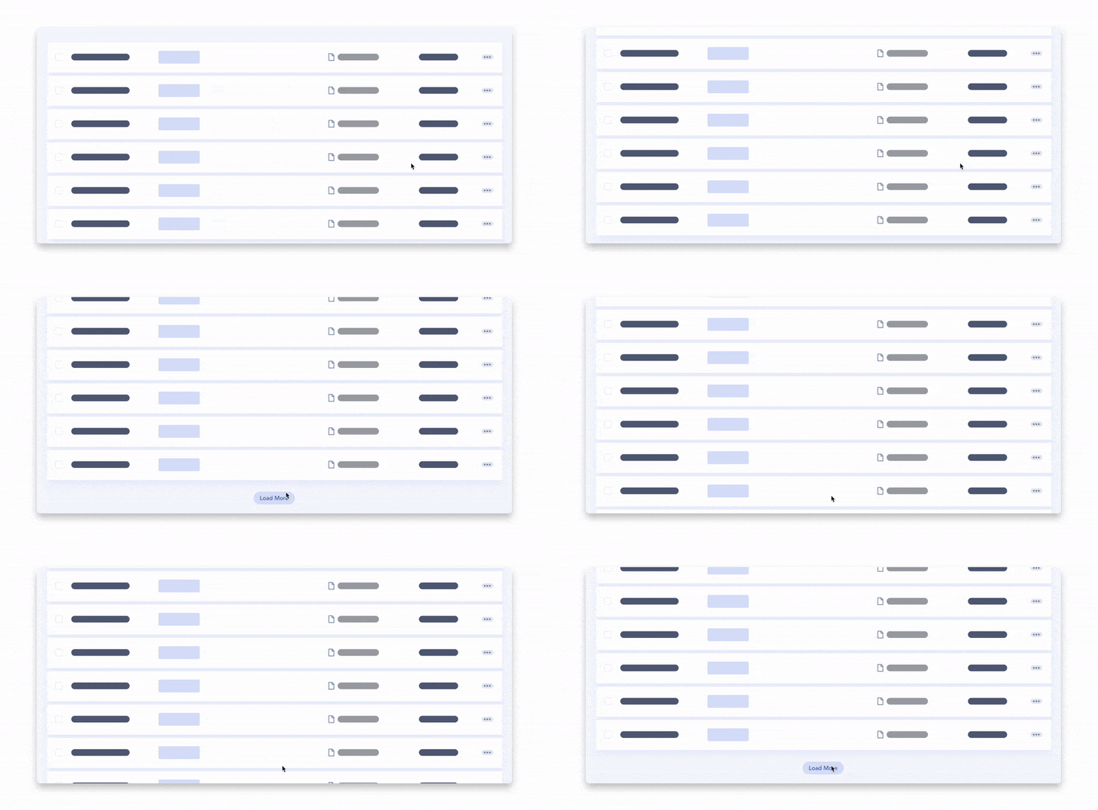
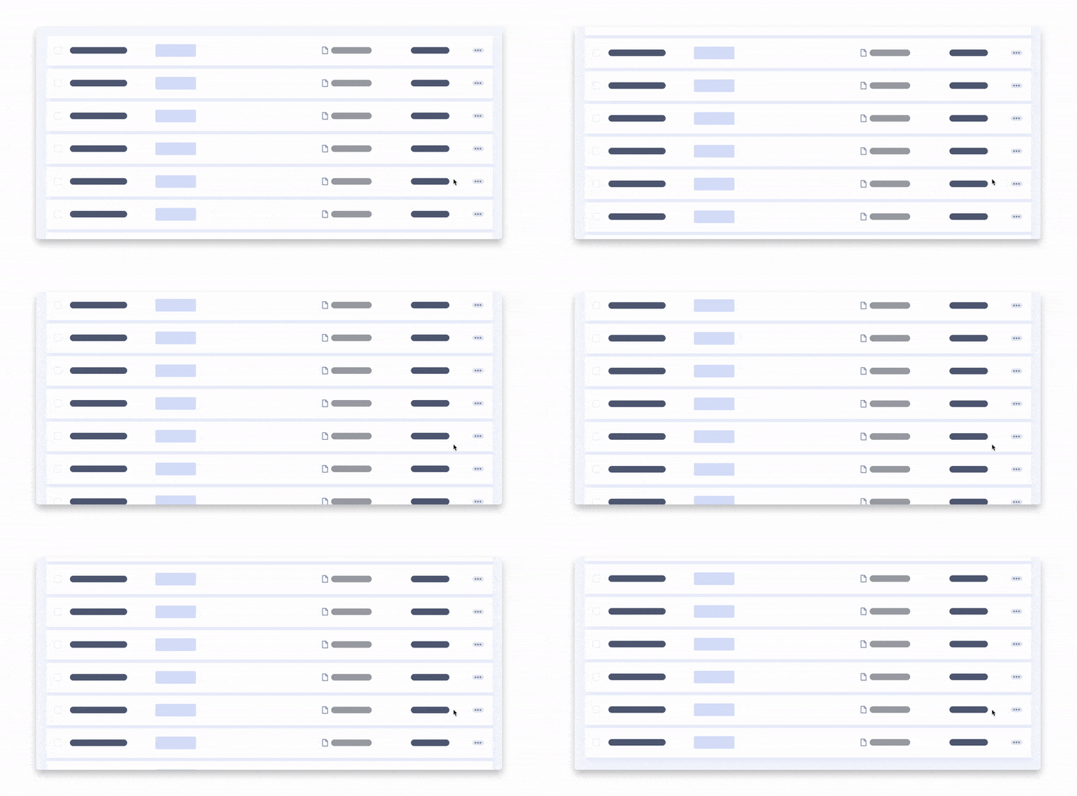
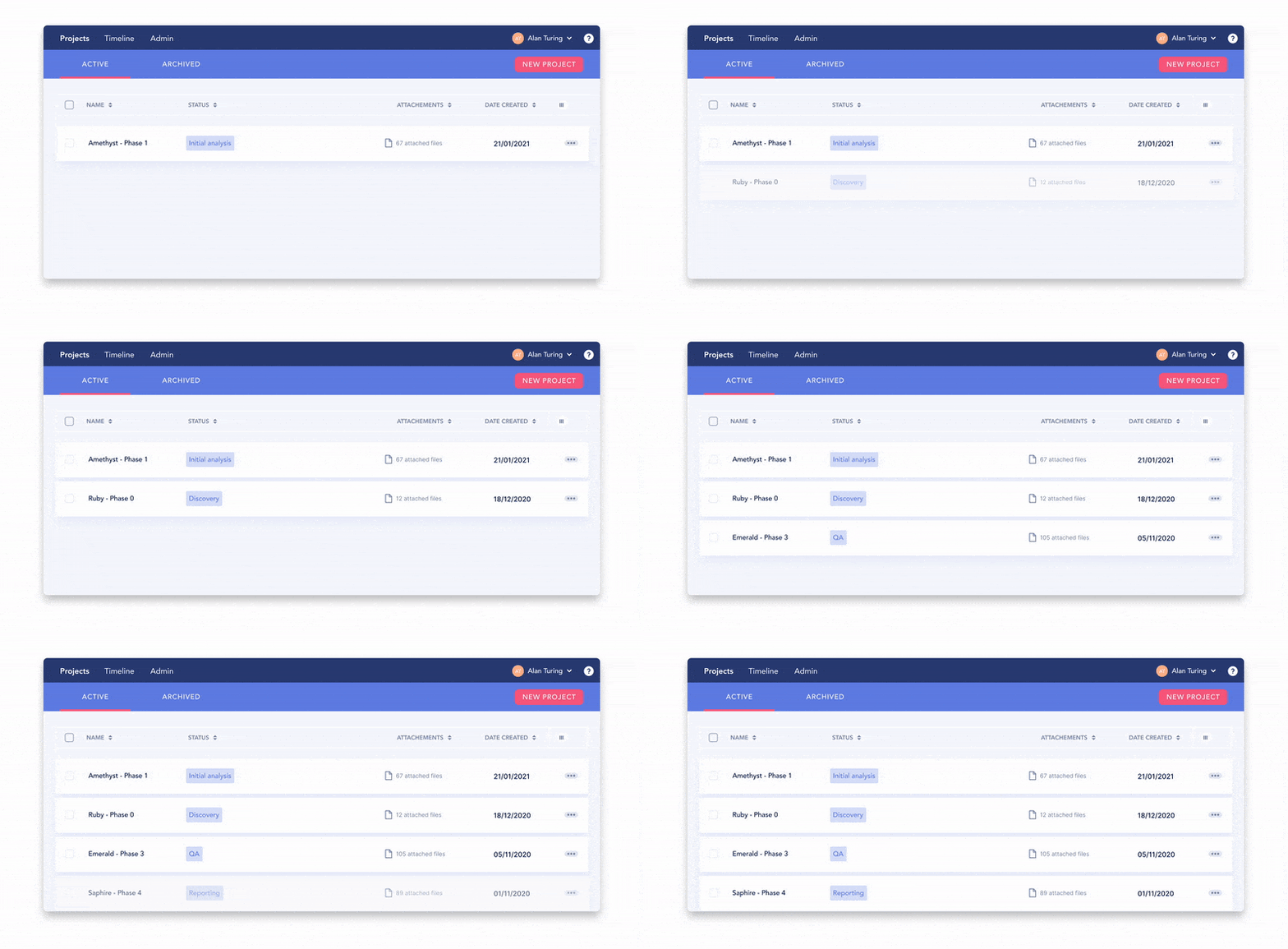
3. Skeleton Screens (Ghost Elements)
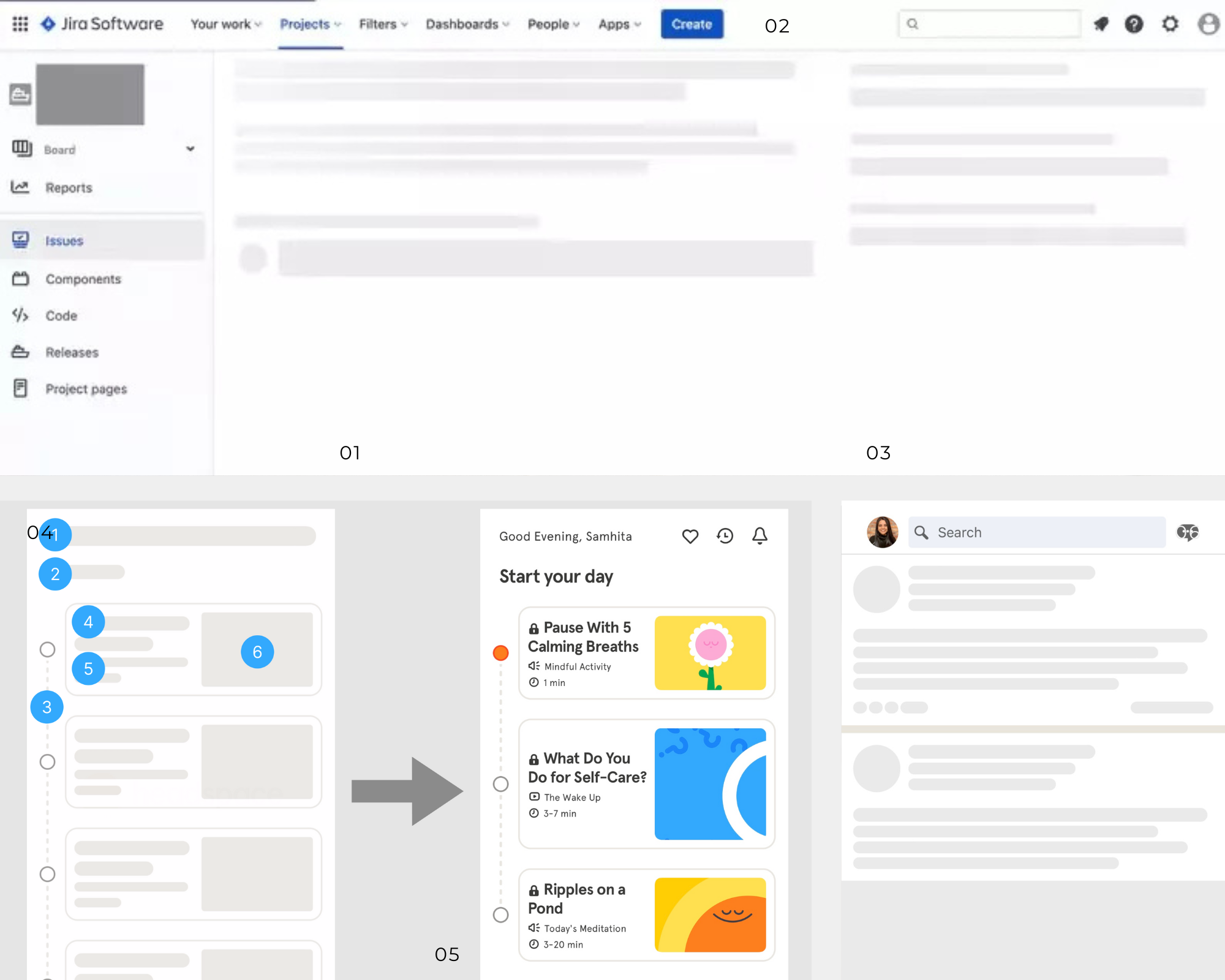
What they are: These are wireframe placeholders resembling the layout of the eventual page or component. They essentially are a text block in gray lines and grey boxes indicating images. A few have also added subtle shimmer effects similar to what was popularized as Facebook's "shimmer loader".
When to use:
Content-heavy pages: feeds, timelines, image galleries
Full-page load of dynamic content
Pros:
Decreases perceived wait by showing outline of the eventual layout
- Allows users to internally estimate the arrival of the content
Disadvantages:
- Overkill for very short waits (less than 1 second)
- The animation effects can be distracting or lead to accessibility issues if not done correctly.
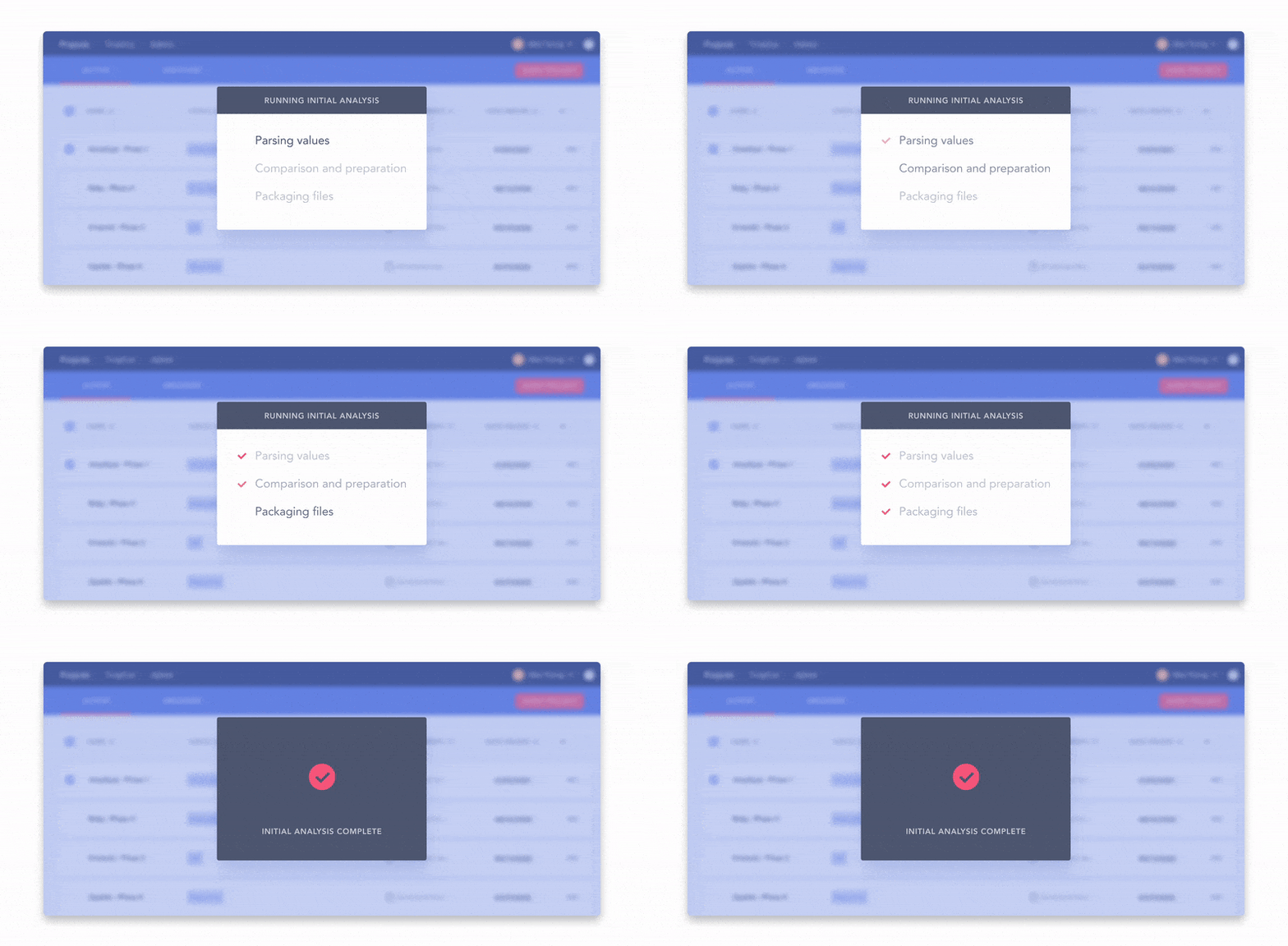
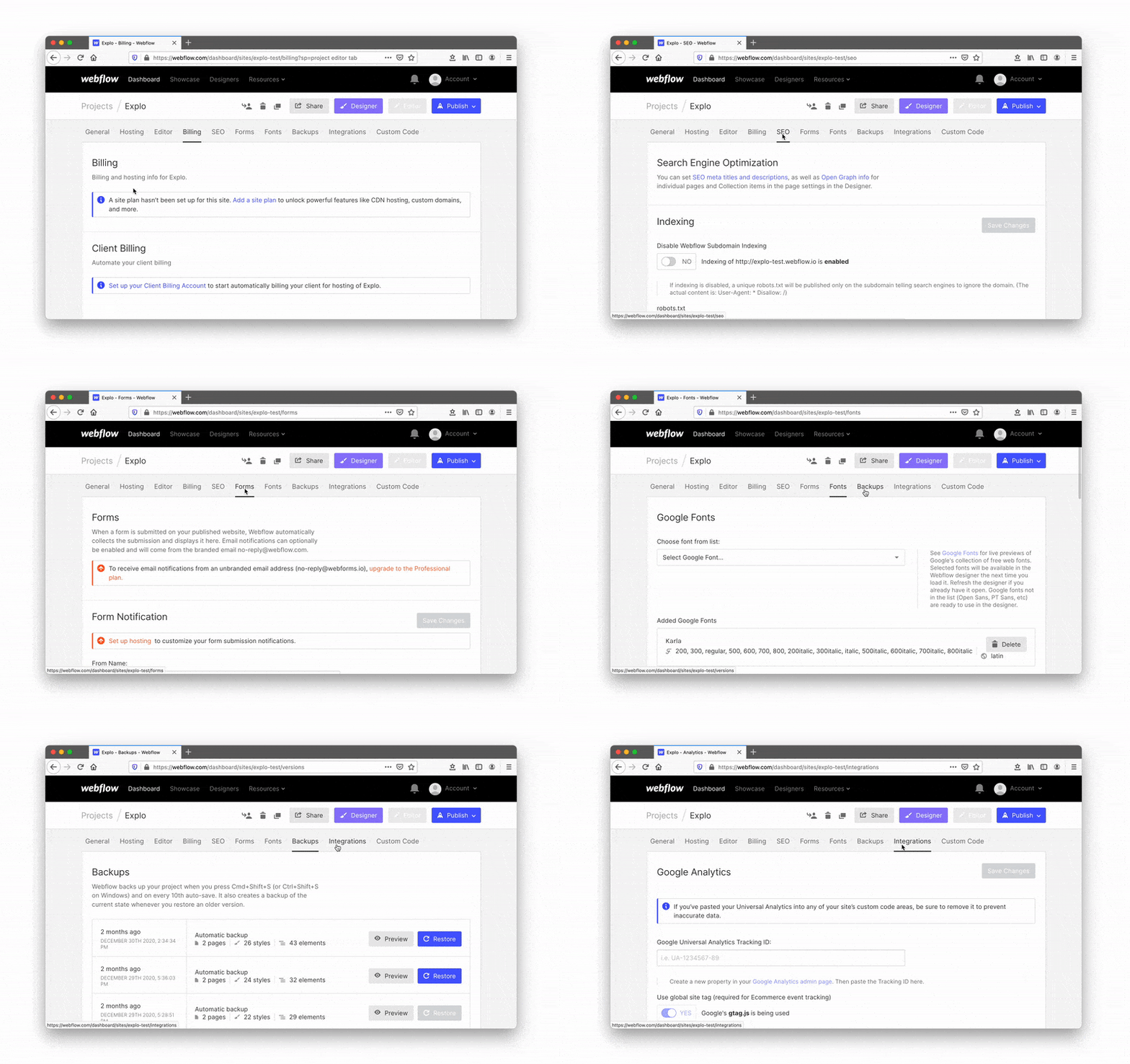
4. Preloaders (Loading Screens)
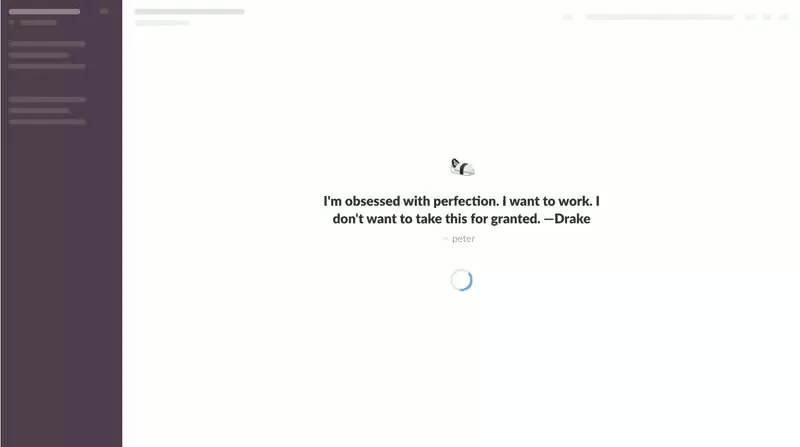
What they are: Full-screen overlays or animated elements that display prior to content being ready to be viewed. They can range from playful to branded, often taking up the full screen.
When to use:
- Large or complex tasks run upfront, such as data-intensive dashboards
You want to include some brand personality or short educational messages.
Pros
- Strong branding opportunity. Users can feel "entertained" or "informed" as they wait.
Cons
- Can block the entire interface and disrupt user flow.
Can be potentially frustrating if too long or repetitive.
Designing for Different Wait Times Under
0.1s
- Feels almost instantaneous-no loading pattern typically needed.
- Optional: If the action is “significant,” use a brief “fake” loader to create a sense of importance (e.g., “We’re double-checking your data…”).
0.1–1s
- Users notice a slight delay, but it’s still manageable.
Avoid large spinners that flicker on and off too quickly—this can be more confusing than helpful.
1–2s
- Spinners or skeleton screens become beneficial because the wait is noticeable.
2–10s
- Now we’re in the range where more informative progress indicators shine.
- Consider skeleton screens or a loading screen with a progress bar or text telling users what’s happening (“Fetching data…”).
10s and above
- Consider showing exact percentages or step-by-step progress messages.
- Offer the user an option to cancel or let them know they can navigate elsewhere while the task runs in the background.
- "We'll email you when this is done" can save your life for very long tasks.
Tips to Make Loading More Enjoyable
- Use Meaningful Microcopy: Explain what's happening ("Uploading your file," "Exporting your report"), especially if the action is high value or crucial.
- Educate or Entertain: Show quick tips, product facts, or playful animations that distract from the wait.
- Brand It: Add your brand colors, fonts, and tone. Slack uses quirky messages while Duolingo shares fun facts to keep people entertained.
- Stay Consistent: Keep the patterns of loading on your app or website the same. Familiarity eases user anxiety.
Common Mistakes
Never-Ending or Stuck Loaders
-If your loader appears to be stuck, users will assume that the system is broken.
When you notice this process stalls, provide a fallback or error message.
Frame-Only Skeletons
Use skele¬tons - add enough placeholders so that users can be given an idea of what the end layout might look like. An em¬pty background with nothing on it but a header could also create confusion for users.
Overusing Spinners
Every¬thing triggers a full-page spinner; sometimes, partial or inline loading states make more sense for user flow.
Poor Accessibility
Animations of high contrast or rapidly moving can cause an issue to those with motion sensitivities. Offer alternative options for allowing users to opt-out of animated motion.
Loading is inevitable, but it needn't be excruciatingly slow. Done correctly, using a loading pattern from the subtle in-line spinner and structure-revealing skeleton screen to a playful pre-loader with some branded flair, an annoying pause turns into an informing, entertaining, or reassuring moment for your users.
Takeaway:
The key to success lies in considering the scope of data being loaded, the context of the user, and the time the user will have to wait. By doing so, and adjusting your approach accordingly, you'll keep your users in control and happy-even when they have to wait.
By designing thoughtful loading experiences, you’re not just cutting down on user frustration—you’re building trust and demonstrating that every detail of your product is crafted with user delight in mind. So, the next time your users are stuck waiting, give them something positive, purposeful, or even playful to keep them around (and happy) until the content arrives.



Reference and idea to Used
css-loaders
blog_userpilot